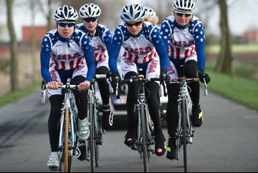
I have a pet peeve about cycling clothing with the lettering upside down. In my mind there isn’t an excuse for it. Above is a photo from the US Women’s Nationals Team at the Tour of Flanders. I have never seen lettering that is more wrong than this. It is upside down on the shorts. And facing up. I guess if the television shot is from the helicopter, then it is just upside down.
When I was riding for Wheaties/Schwinn, Michael Vaartens had a hook up with a Belgium clothing manufacture, so we had the clothing made there. It was a super fast turn around. When we got the clothing, all the long sleeve jerseys and skinsuits had the arms sewn on wrong. Opposite. So all the writing was upside down. I couldn’t stand it. So, I took my arms off and sewed them on correctly. We raced all Spring in some pretty horrible weather. It took at least two months before someone on the team said that our clothing was printed wrong. Then, everyone jumped in on the discussion. I didn’t say anything. A couple weeks later, there was a photo in the paper of me at some race with the printing correctly. Amazingly, someone noticed that my sleeves was sewn on right and wanted to know why my clothing was made right. I told them I just switched the arms. They all were like, “wow, what a great idea.” But, not one rider the rest of the year had their clothing altered. Guess it didn’t bother them.

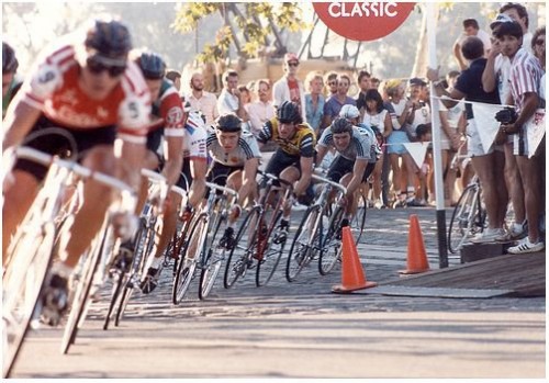
An old Coor's Classic photo from Sacramento coming off the cobbles. Steve Bauer is in front in the leader's jersey. This was a criterium in Old Sacramento that had a real cobble section. Like Belgium cobble. We did this race in the evening after racing from Nevada City to Sacramento earlier in the day. It was a pretty hard day. I am sandwiched between the two East German National Team riders in gray. They only had 3 riders come to the race that year and they won the team GC overall. Pretty crazy.


I wonder if the ToC is using the exact same route as the Coor’s Classic? The cobbles in old town are fun to ride once in a while, a little bit rougher than the bricks in Potwin.
Hope you don’t have to use the new Bontrager tires. totally upside down script.
Wow, the leader of a stage race on the front? Who would’ve thunk it.
Pingback: Fearless Real Estate Investing! | Stock Market Group